
TMA’s platform had evolved over multiple years, with features and modules added incrementally. While the functionality was strong, the user experience became increasingly difficult to navigate due to inconsistent UI patterns, dated styling, and limited scalability in the front-end foundation.
This project focused on improving the platform’s usability, strengthening visual consistency, and creating a more up-to-date, attractive product experience, without disrupting existing workflows.
Problems
Product-level challenges
Outdated look & feel that no longer matched a modern SaaS standard.
Inconsistent UI patterns across modules (typography, spacing, buttons, states).
Unclear information hierarchy, making key pages harder to scan.
Rising user confusion, resulting in more “where can I find…” questions.
Delivery & technical constraints
The platform is large and interconnected, with parts of the codebase historically outsourced
Changes in one area could unexpectedly impact other modules due to shared dependencies.
The UI was largely built on an existing Bootstrap template, limiting how far visual changes could go without refactoring.
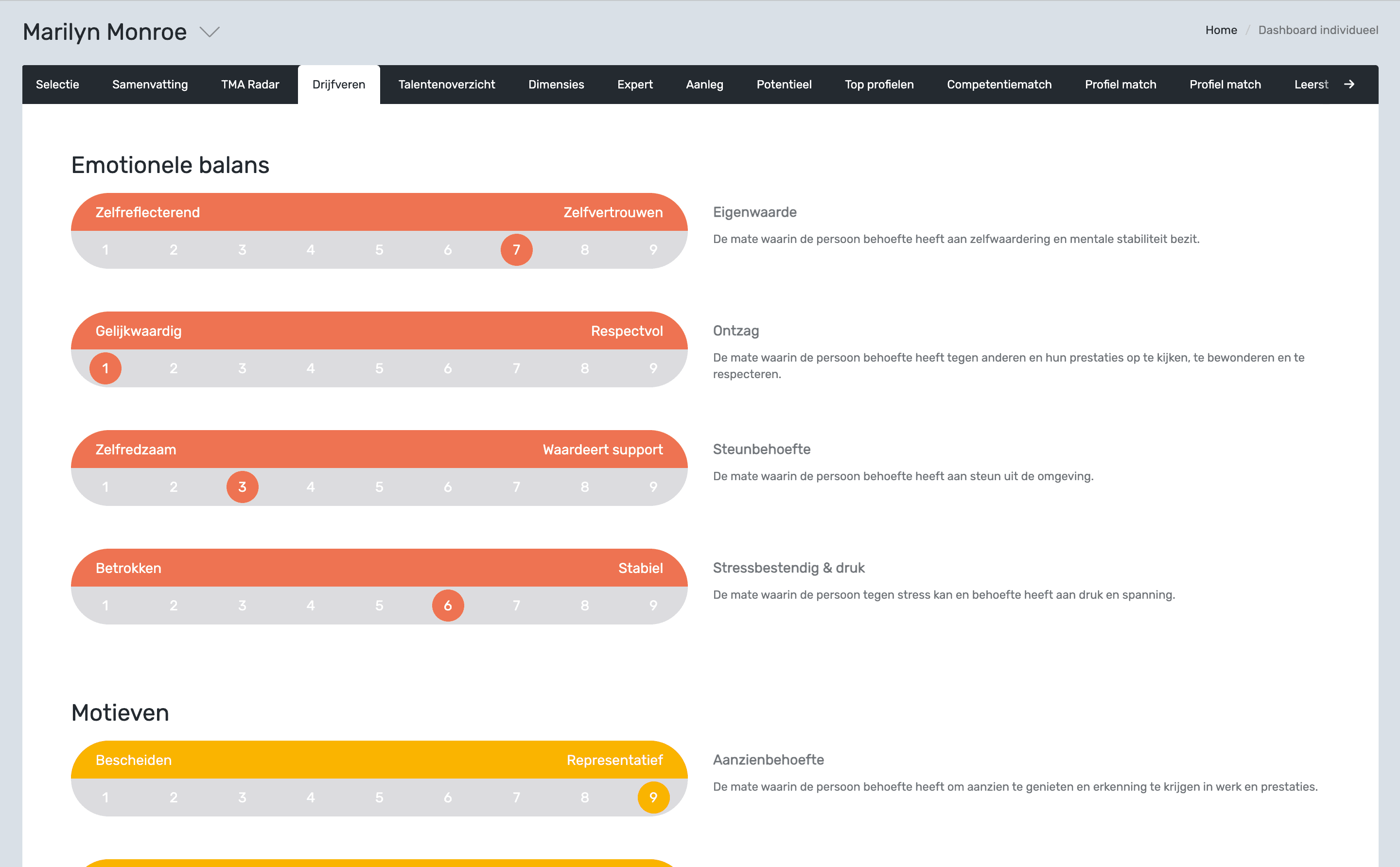
The design below shows an earlier version, created by the previous designer, and is included for comparison with the final results.
My Approach
To safely improve UX in a large platform, I worked iteratively and aligned design decisions closely with development constraints.
UX & UI audit: mapped inconsistencies across key screens and components.
Design principles: defined clear standards for hierarchy, spacing, readability, and interaction states.
Incremental rollout: redesigned module by module to reduce implementation risk.
Developer alignment: validated changes early with devs to avoid design decisions that would break core templates.
Product Improvement
The design improvements focused on creating a more contemporary and intuitive product experience:
Typography refresh: Improved hierarchy and readability across headings, labels, and body text.
Layout & spacing system: Introduced cleaner grids and consistent spacing for better scanning.
Modernized colour usage: Reduced visual noise and applied semantic colours for clear states.
Reusable component library: Standardized core components to ensure consistency and speed future work.
Predictable patterns: Unified templates and interactions so users can navigate confidently.
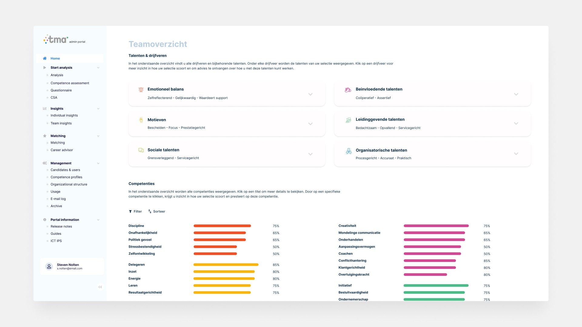
Team Overview page
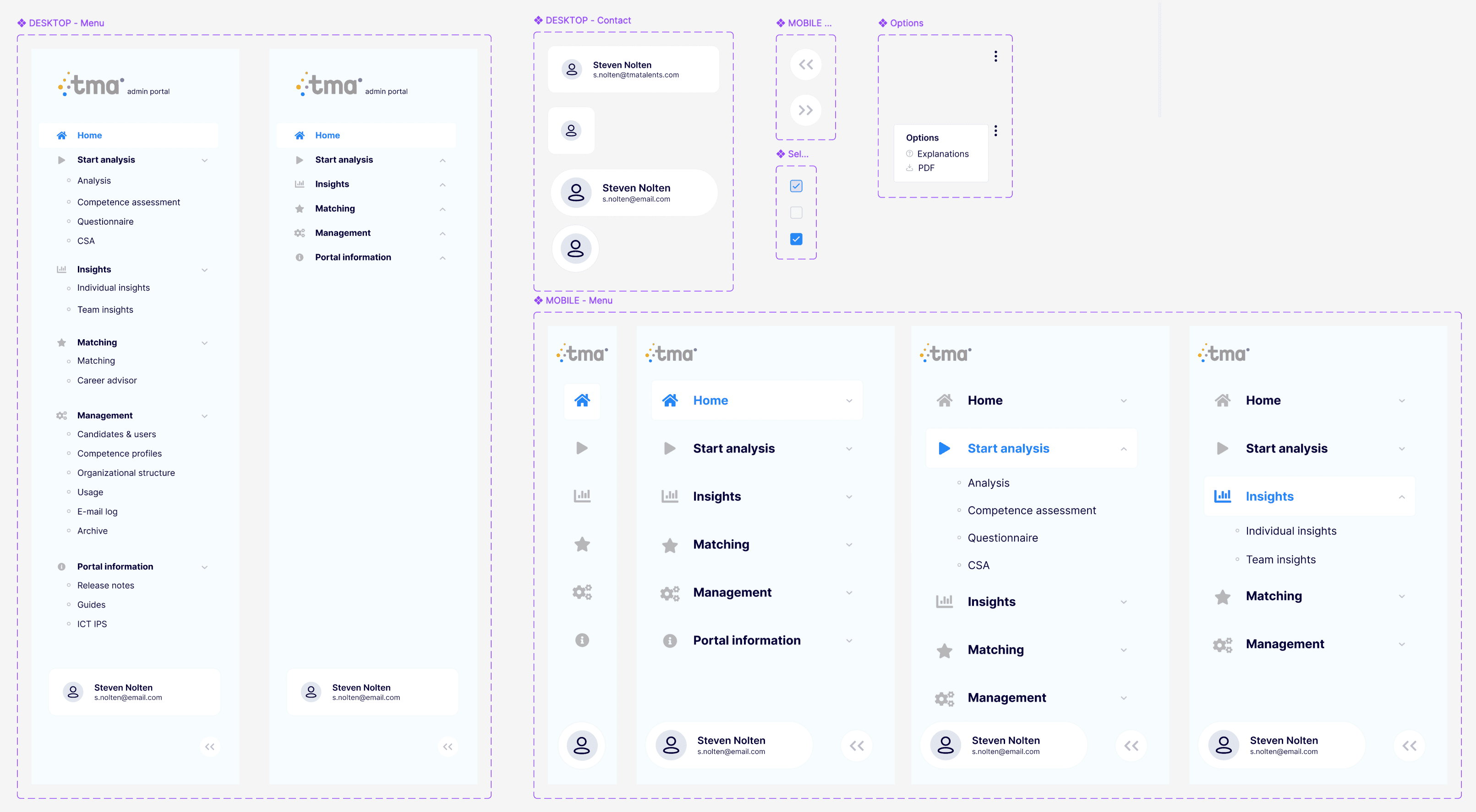
Component Library - Navigation Desktop & Mobile
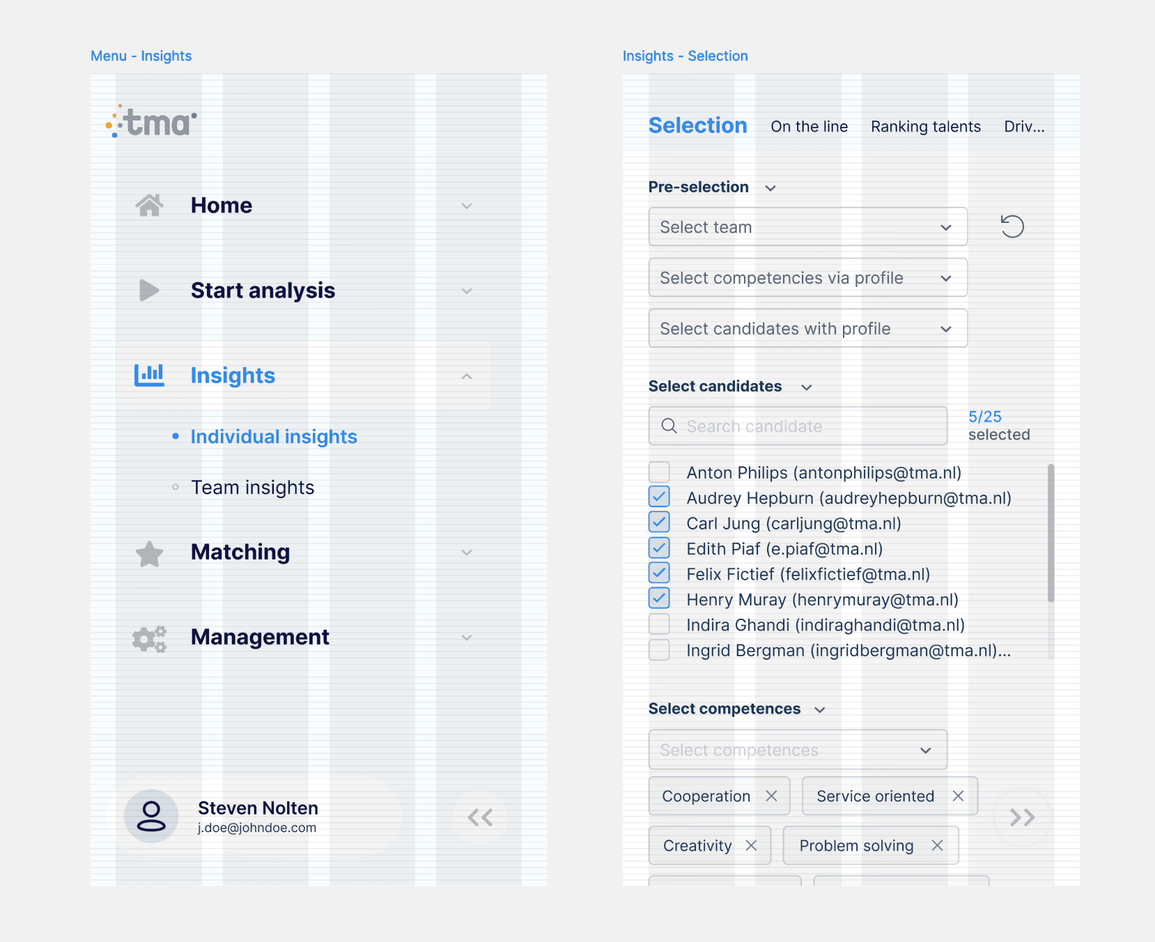
Mobile - Layout Grid
Impact
Reduced internal support questions related to navigation and page clarity
Faster time-to-action on high-traffic screens due to improved hierarchy
More consistent patterns across modules, lowering the learning curve for new users
Cleaner design–development collaboration through reusable components and clearer standards
Note: Exact product metrics are confidential. The outcomes above are based on internal stakeholder feedback, support trends, and observed usability improvements.

