
Note: Due to privacy and confidentiality, not all screens and design details can be shared publicly. The work shown here has been carefully selected and anonymised where necessary.
Project at a Glance
Client: MyTalentBoard
Industry: HR Tech / Talent Development
Project Duration: 7 months (2023–2024)
My Role: Lead UI/UX Designer
Team: Product Owner, 2 Front-end Developers
Scope: Navigation overhaul, dashboard redesign, skills workflow, assessments, UI modernization, design system
Impact: –34% platform-related support tickets, +22% task completion speed, improved customer onboarding experience
The Challenge
Before the redesign, the platform faced several key issues:
Outdated and fragmented UI
Multiple visual styles existed side by side. Components varied in spacing, color usage, icons, and typography. Users felt the product was “patched together” rather than unified.
High cognitive load
Important workflows such as assignments, assessments, and skill overviews presented too much information at once. Users struggled to understand what they needed to do.
Increasing number of support questions
Many of the customer support volume consisted of basic navigation questions, such as:
“Where can I find the skills overview?”
“How do I check assignment progress?”
“Where can I adjust my goals?”
This indicated structural UX problems, not user error.
Poor accessibility
Text contrast, spacing, and component structure did not meet WCAG guidelines. For a platform used by employees with varying digital skills, this was a major concern.
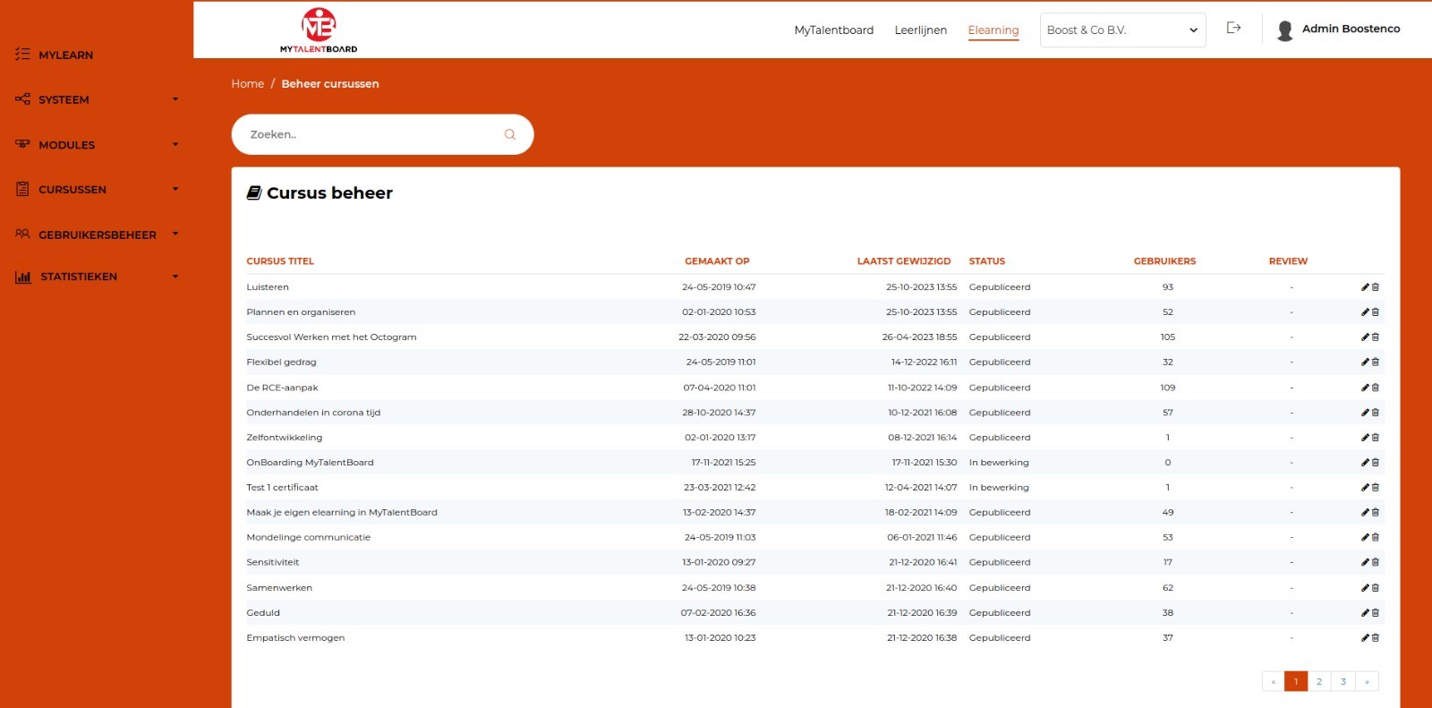
The designs below are from the earlier version, created by the previous designer, and are included for comparison with the final results.
Goals & Success Criteria
Business Goals
Reduce support volume related to navigation.
Increase customer confidence through a modern, unified UI.
Improve onboarding of new clients.
Create a scalable design foundation for future modules.
UX Goals
Clear, predictable navigation structure.
Lower cognitive load in key workflows.
Consistent UI patterns and terminology.
Improved readability and accessibility.
Success Metrics
–30% navigation-related support tickets (first 3 months)
+20% faster completion of key workflows
At least 80% positive feedback from pilot users
Noticeable drop in “Where can I find…?” questions
Rebuilding the Information Architecture
The new IA is structured in three clear levels:
Primary navigation:
Dashboard — Testing — Matching — Developing
Secondary modules:
Skill Overview, Feedback, Learning Path, Team View, Goals
Detail screens:
Skill breakdown, assignment progress, feedback lists
This structure drastically improved predictability and reduced confusion.
Creating a Calm, Modern, and Consistent UI
The core design direction: “Modern, attractive, and intuitive.”
Key improvements:
A clean, minimal color palette with semantic color tokens
Clear typographic hierarchy
Significantly more whitespace and breathing room
Components redesigned for clarity and accessibility
Simplified layouts with a stronger visual rhythm
The result is an interface that feels calmer, lighter, and more professional.
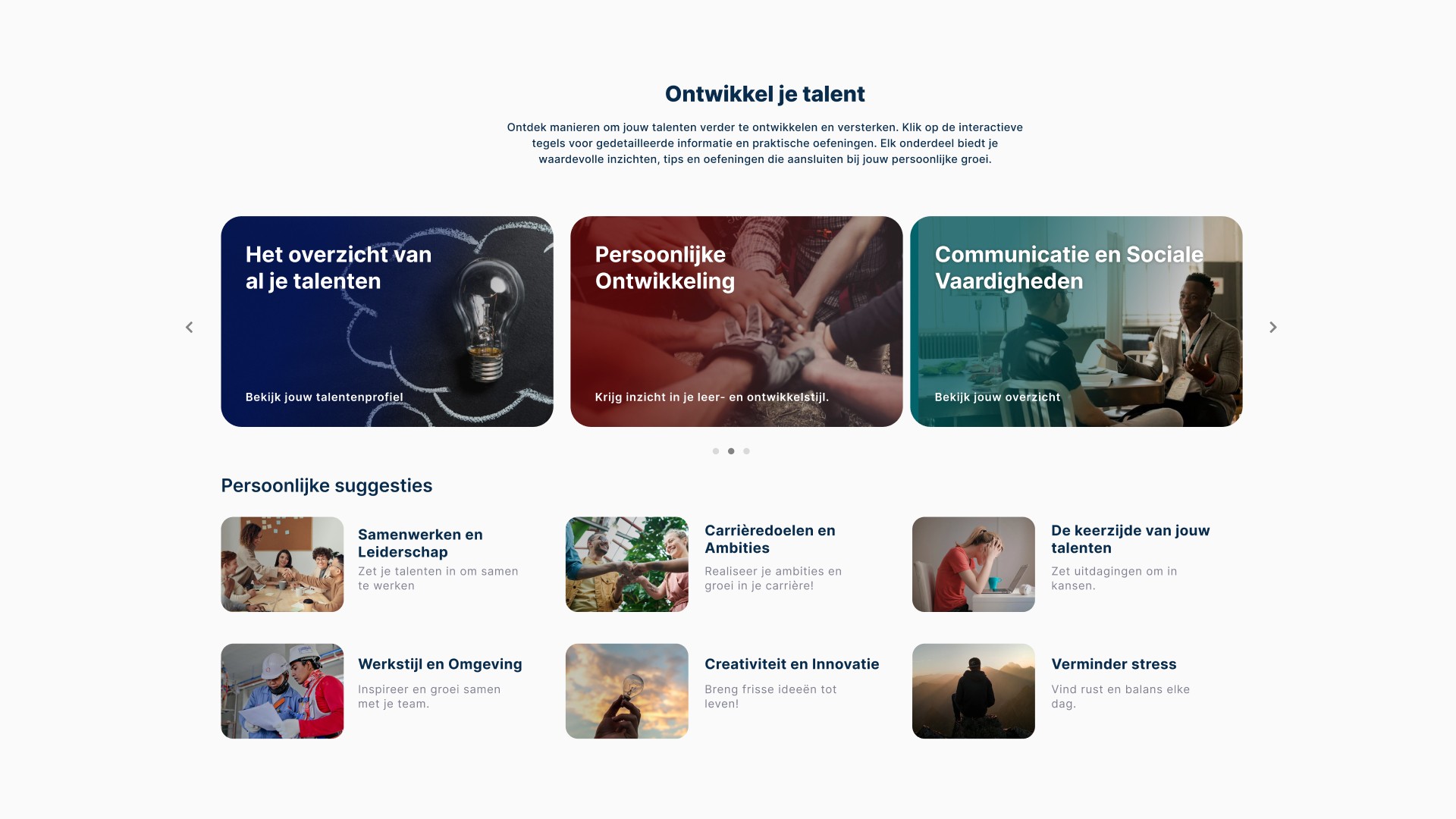
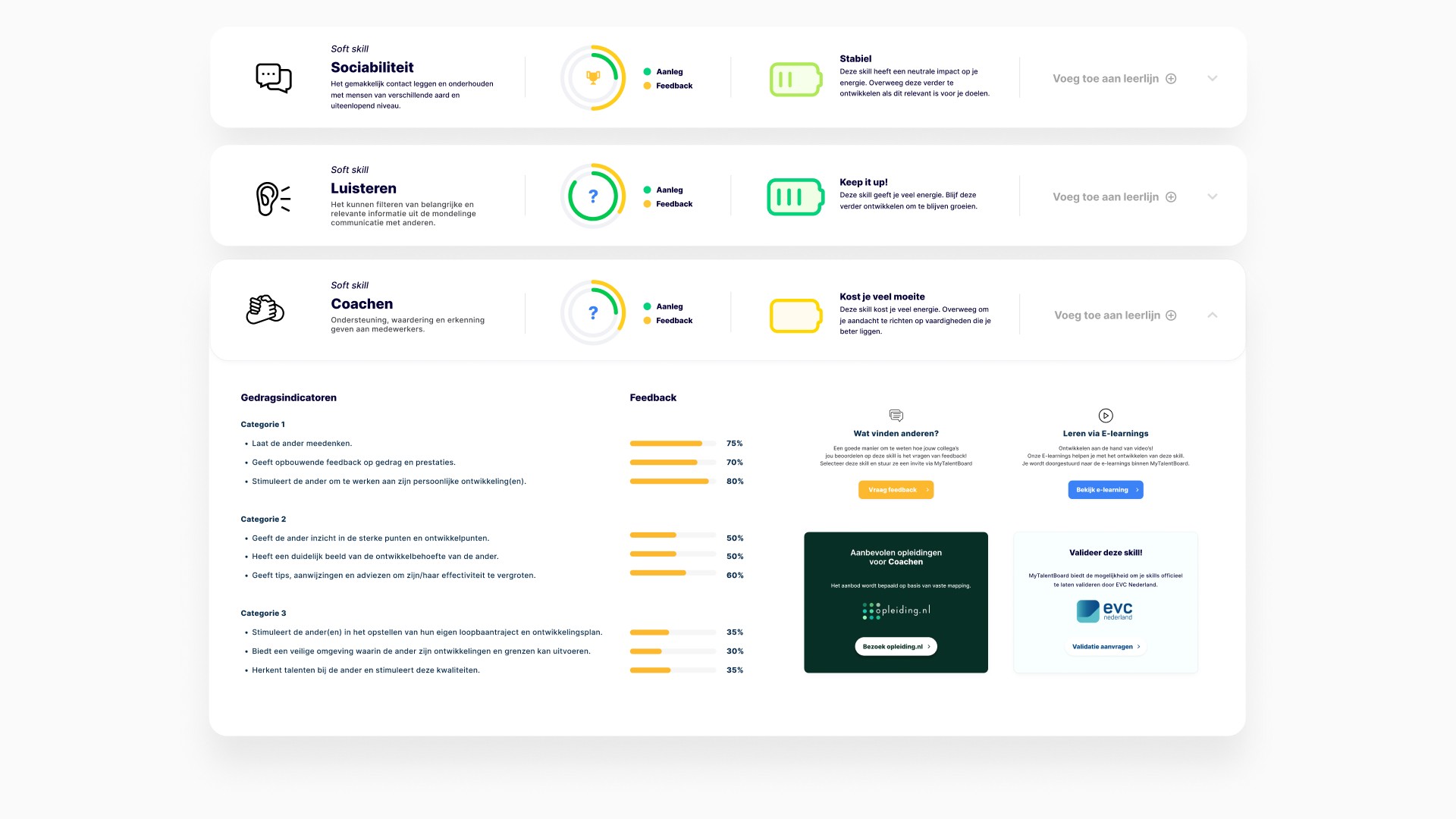
Redesigning Key Workflows
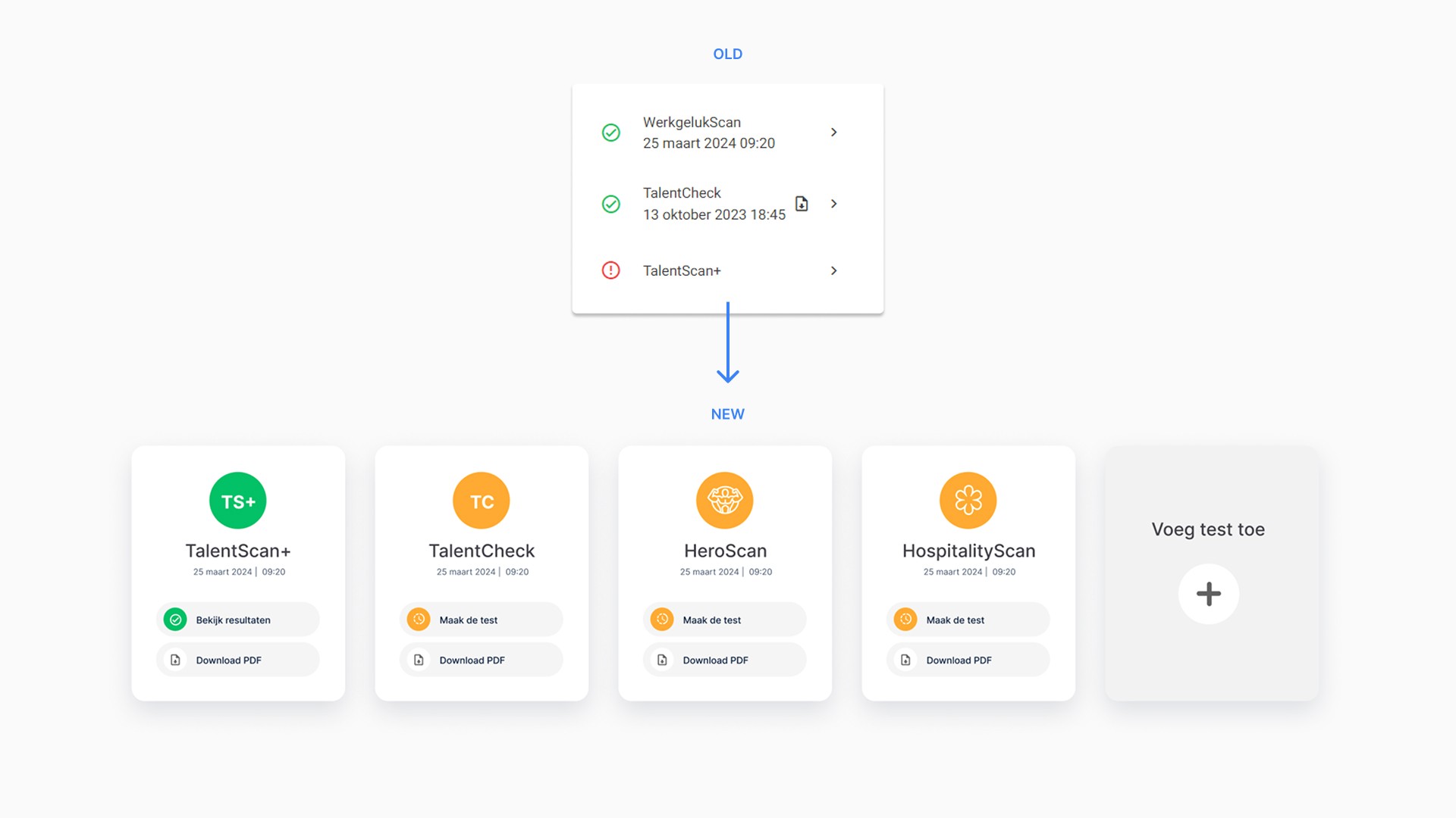
Skills Overview & Detail
The previous design was dense and visually overwhelming.
The new design includes:
clearer distinctions between skill types
improved progress indicators
simplified layout and better grouping of information
reorganized actions based on user mental models
improved mobile experience
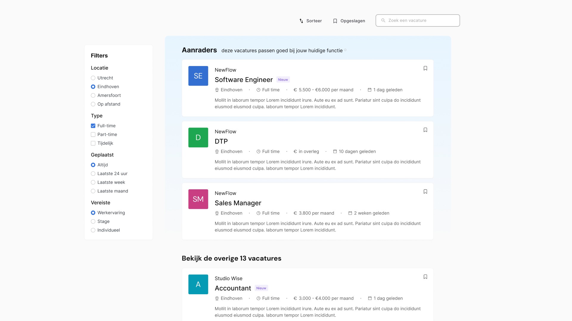
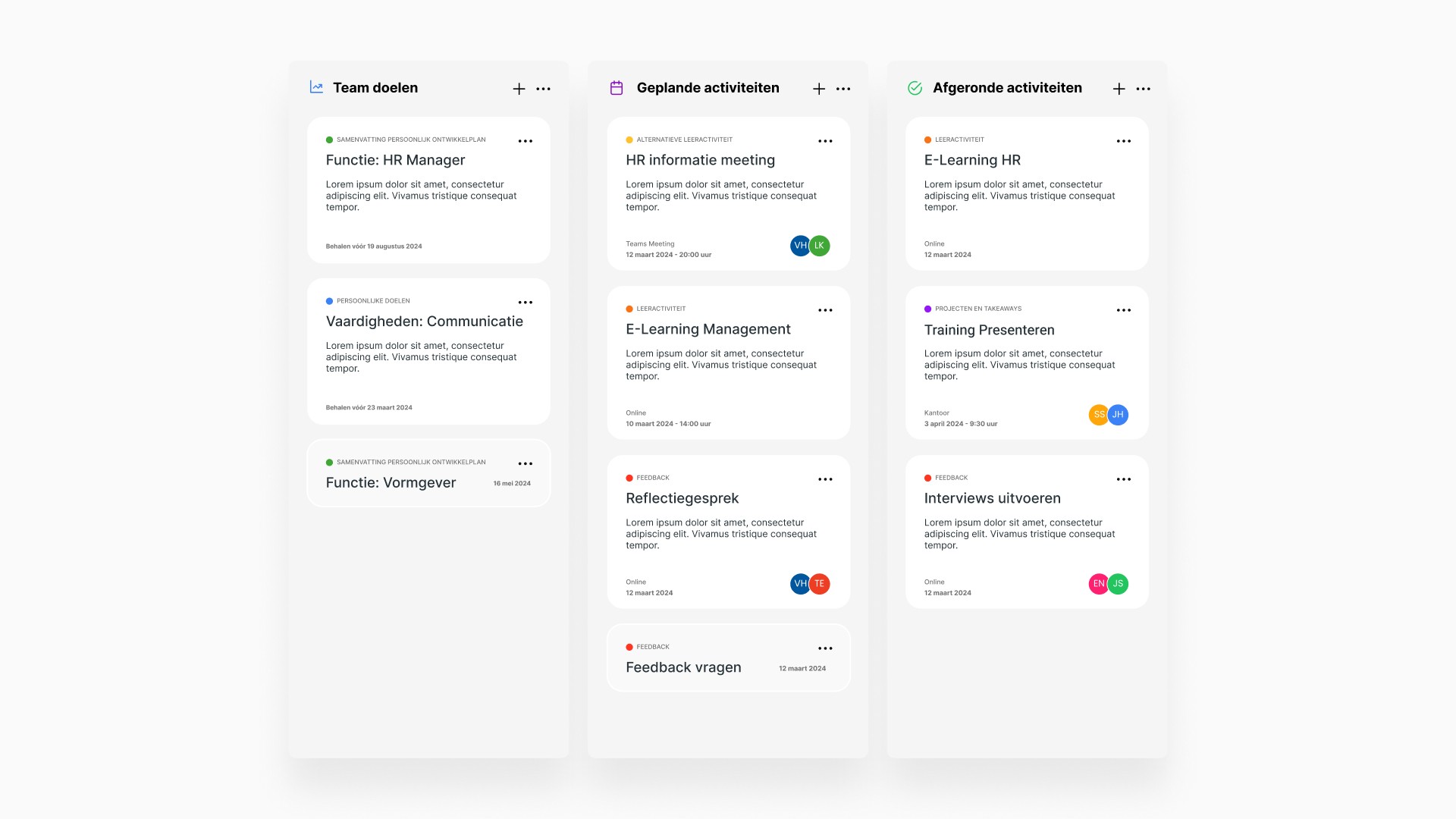
Assignments
Tasks were split into clear categories: Team Goals, Scheduled Activities, Completed Activities
Heavy text blocks were replaced with clean, modular layouts
Multi-step tasks were simplified into guided flows
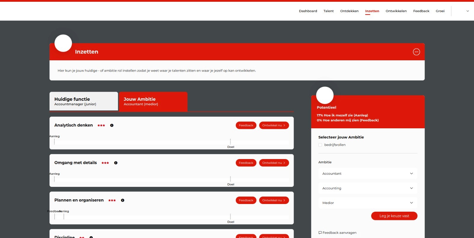
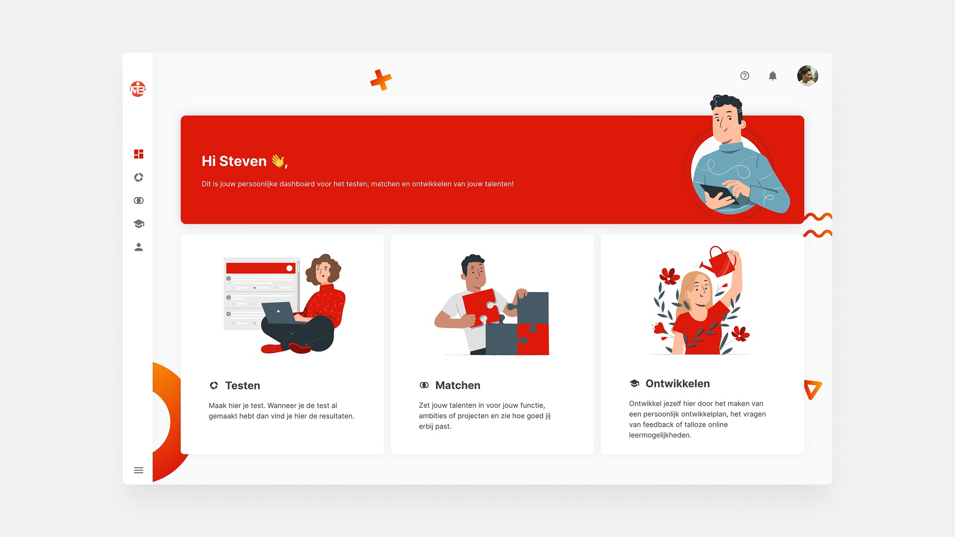
Dashboard
Personalized (color scheme, layout, and tiles) based on role and/or company. In this case, the color scheme of the company is red
Prioritized next steps and relevant content
Improved scannability
Design System
To ensure consistency across upcoming releases, I created a scalable design system including:
Component library (cards, tables, tabs, alerts, forms)
Typography scale & spacing rules
Color tokens for semantic meaning
Iconography and pattern guidelines
Accessibility standards (WCAG AA)
Interaction states and motion rules
This provided developers with a stable, future-proof foundation.
Results
–34% navigation-related support tickets
The biggest drops occurred in questions related to finding skills, assignments, and progress.
+22% improvement in task completion speed (Microsoft Clarity)
Especially in the assignments and skills workflows.
Higher usability ratings
Pilot users rated the new interface 8.7/10 for clarity and ease of use.
Significant improvement in onboarding
Customer success teams reported that new customers became independent more quickly.
Stronger platform credibility
Partners and resellers described the new platform as “clean, consistent, and easy-to-use.”
